APPLE PODCASTS | SPOTIFY
Whether you like it or not: Aesthetics DO matter on Instagram!
But don’t get me wrong, I’m also the first person to tell you:
“Stop obsessing over what your IG grid looks like!”
“It’s the content within your grid that matters!”
“It’s more important that people actually want to consume your content (AKA see the value)”
“The most important part of social media is the ‘social’ part – building relationships!”
All of this ^^^ is true! Yet at the same time, aesthetics matter too.
Take your Instagram explore feed for example. You’re drawn to certain posts and not others. BUT, why are you drawn to the posts you are?
Do you notice that you’re drawn to posts that use similar colors, fonts (sizes of fonts), patterns, etc.?
There’s a reason for that! Visuals play a big role in what gets us to stop and pay attention to something.
Why aesthetics matter on social media
- They serve a purpose! To catch attention, stop the scroll, and make people want to consume your content.
- To build your confidence in your brand and help you show up consistently.
- It makes your content creation process easier (which saves you time!)
In this episode, I’m spilling 7 simple swaps that will make your content look better – no graphic design degree necessary!
If you rewind the clock to 2013, when I first started posting on IG for my business – my aesthetics were awful. I’m talking, generic sepia Instagram filter awful. But I’ve come a long way since then and there’s some much I’ve learned!
This episode isn’t me telling you that you need a fancy, all white Pinterest kitchen to start recording reels in.
Or that you need to have a full face of makeup and perfect hair to show your face.
Perfection is not required here! We’re focusing on how we can make your content creation easy, and make your content look good.
How to make your real estate social media content look better
- Make your content easy to read.
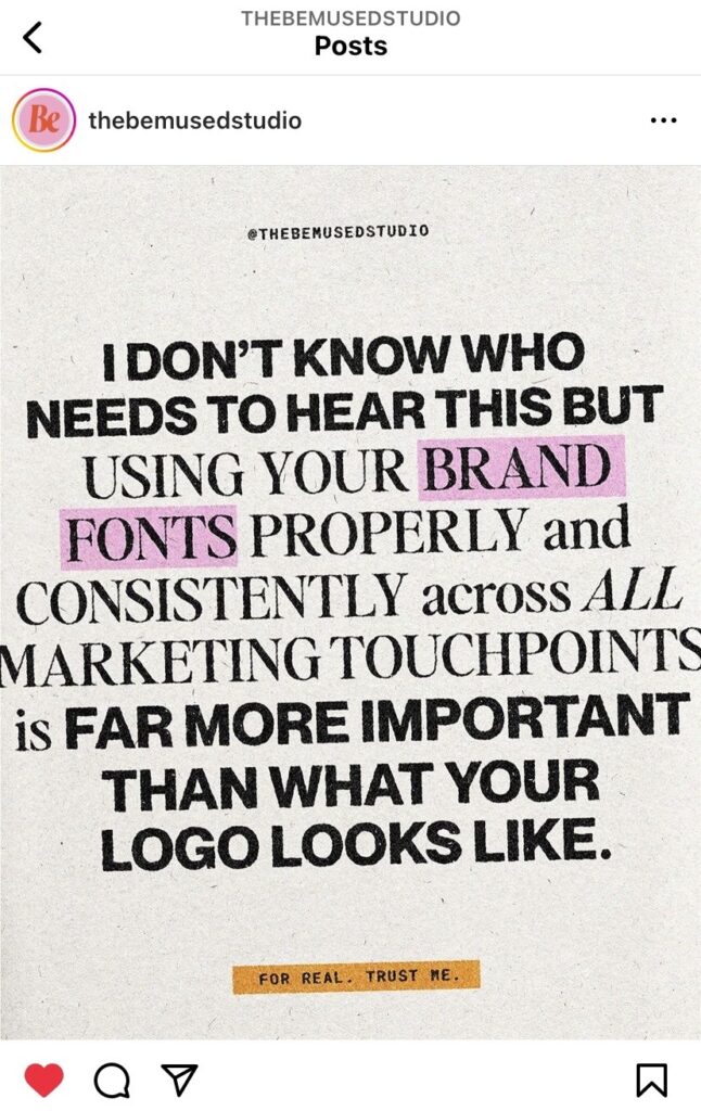
- Nail down your fonts! (Header, sub header, body)
- Make your a brand color palette.
- Pay attention to the layout.
- Incorporate highlighting.
- Focus on consistency.
- Never start with a blank canva template.
After listening to the episode and implementing these aesthetic swaps, your content will be:
More attention grabbing, easier to consume, easier to create, & more recognizable!
THINGS I MENTION IN THE SHOW
Things that pair well with tip #3: color palette generator website & another place to go for color palette inspo
An IG post that I couldn’t resist sharing